The Logo Design Process: From Sketch to Brand System
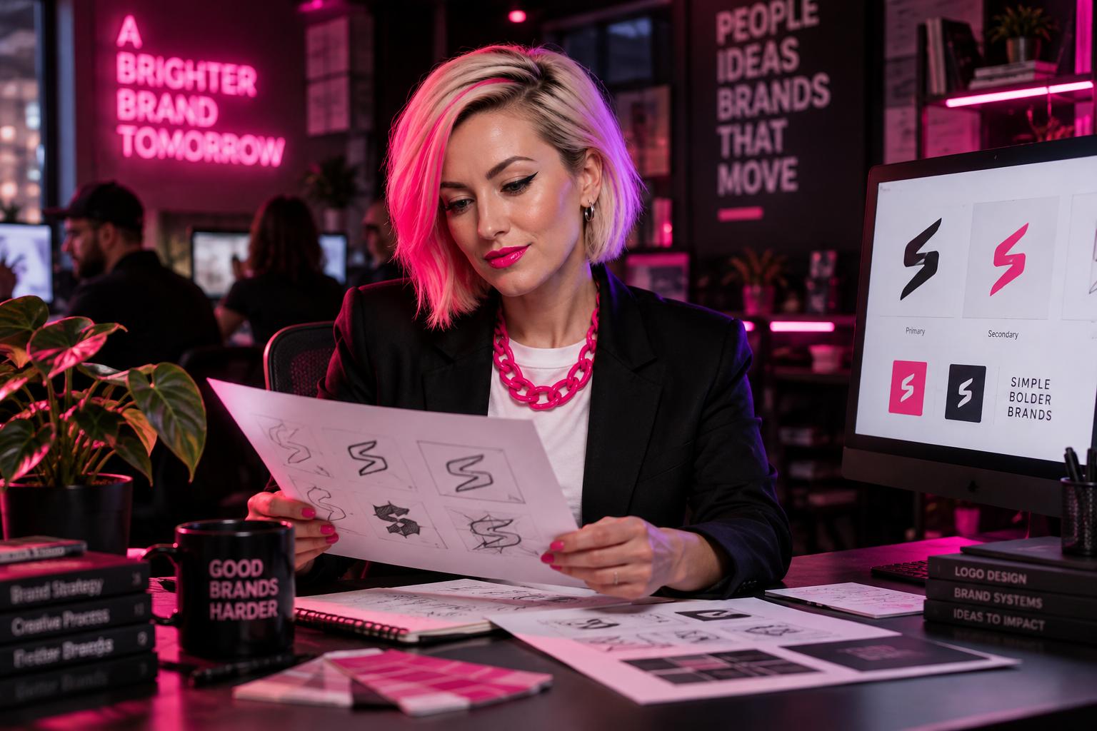
The logo design process should solve a business problem, not become a month-long debate about shades of blue. A strong process takes you from rough sketches to a usable brand system: a recognizable mark, supporting visuals, and clear rules that keep everything consistent.
Start with the job your logo needs to do
Before anyone draws, agree on what the identity needs to communicate. A family-owned manufacturer entering national markets has a different challenge than a neighborhood restaurant opening its second location. Both need recognition, but their audiences, applications, and existing brand equity differ.
Create a one-page brief that answers five questions:
- Who are we trying to reach? Name the people making or influencing the purchase.
- What should they understand about us? Pick two or three meaningful qualities, not ten generic adjectives.
- What makes us different? Identify something competitors cannot all claim.
- Where will this identity appear? Include websites, uniforms, vehicles, packaging, signs, and proposals.
- What should stay? Preserve recognizable elements when they still serve the business.
Also settle the business name before designing around it. The SBA’s business-name guidance explains the differences between entity names, trademarks, DBAs, and domain names. A registered business name alone does not settle trademark questions; get qualified legal advice when needed.
The logo design process starts broad, then narrows
Sketching is a way to explore ideas cheaply. Designers can test dozens of relationships between letters, symbols, shapes, and negative space before spending time polishing any one direction. Not every sketch belongs in the client presentation.
The useful question at this stage is not “Which drawing looks finished?” It is “Which idea could express this business clearly and distinctly?” A clever symbol that needs a five-minute explanation probably is not doing enough on its own.
After exploration, ask for a small set of meaningfully different concepts, often two or three. Each should include its rationale and a few relevant applications. Three nearly identical wordmarks in different colors are variations, not three strategic directions.
Agree upfront on decision-makers, review dates, revision rounds, and deliverables. One person should consolidate feedback. Otherwise, your designer becomes the referee for disagreements your team has not resolved.
Give feedback against the brief, not personal taste
“I don’t like green” is a preference. “This green looks too similar to our biggest local competitor” is useful feedback. Owners do not need design vocabulary to give good direction; they need to describe the problem accurately.
Use a simple review order:
- Fit: Does the concept support the audience and positioning in the brief?
- Distinction: Could someone confuse it with a competitor?
- Readability: Can people read the name without help?
- Practicality: Can it work in the places the business actually needs?
Collect stakeholder comments before the review meeting, then resolve contradictions internally. Avoid asking twenty people to vote on their favorite. A small check with relevant customers can reveal confusion, but popularity alone should not make the decision.
Choose one direction to refine. Combining the icon from one concept, lettering from another, and colors from a third usually breaks the logic that made each work.
Test the logo where it will actually live
A polished mockup can make almost anything look convincing. Before approval, take away the flattering background and test the mark under ordinary conditions.
- Small: Check a mobile website header, social avatar, and small printed label.
- Large: Review signage or vehicle layouts at a realistic viewing distance.
- One color: Make sure the design survives without gradients or color separation.
- Light and dark: Confirm that approved versions remain clear on both.
- Production: Ask your printer or embroiderer about thin lines, small gaps, and minimum sizes.
Print the logo at its intended size. Look at it on a phone. If staff will wear it, request a production proof rather than trusting a shirt mockup. These checks catch problems while changes are still manageable.
Not every application needs the identical arrangement. A horizontal logo may suit a website header while a compact version suits a square avatar. The goal is a recognizable family, not one file forced into every space.
Build the identity around the mark
A logo identifies the business. A brand system helps the business look like itself everywhere else. That system should include typography, a color palette, layout principles, photography direction, and supporting graphic elements where useful.
Choose typefaces for actual work, not just presentation slides. Your team needs readable proposal text, useful heading styles, and fonts it can legally access. Google’s web typography guidance is a useful reference for thinking about readable digital text beyond the logo.
Define which colors work together for everyday text and backgrounds. A color that looks great in a symbol may be difficult to read in a small button label. Brand colors do not automatically make every combination accessible.
This is where logos and branding become an operational asset rather than a single artwork file. Build a few real examples, such as a proposal cover, email signature, and social post, to prove the system works.
Make the handoff usable for people who are not designers
A folder named “FINAL-final-v7” is not a brand system. Ask for clearly named files, a short usage guide, and templates for the materials your team produces most often.
- Logo files: Vector artwork for scaling and production, plus transparent PNG files for common office uses.
- Approved variants: Primary, compact, one-color, and reversed versions, with clear labels.
- Color specifications: HEX and RGB for screens, plus appropriate print specifications confirmed with production partners.
- Usage rules: Clear space, minimum sizes, background guidance, and examples of misuse.
- Ownership and licensing: Written terms covering final artwork, font licenses, and any third-party assets.
Keep the approved assets in one shared location and assign someone to maintain them. For teams posting regularly, turning brand guidelines into social media SOPs helps translate design rules into repeatable daily work.
Roll out the system in a sensible order
Inventory your touchpoints before launch. Prioritize customer-facing places that drive recognition or revenue: your website, business profiles, sales materials, storefront, and active campaigns.
You do not necessarily need to discard every printed item immediately. Set replacement dates based on visibility, cost, and remaining stock. If the identity changes substantially, briefly explain the update to customers so they know the same business is behind the new look.
The Smash Take
A good logo is not the end of the project. It is the foundation of an identity your team can use without guessing. Get the brief right, test the work honestly, and make the handoff practical. If your current identity cannot keep up with your business, start a conversation with Smash about what needs to change and what is worth keeping.
Frequently Asked Questions
What are the main stages of the logo design process?
The main stages are discovery, a written brief, concept exploration, concept selection, refinement, real-world testing, and final handoff. A complete identity project also defines supporting colors, typography, templates, and usage rules. Each stage should have a clear approval point so unresolved decisions do not follow the project into production.
How many logo concepts should a designer present?
Two or three meaningfully different concepts are often enough for a productive review. The designer may explore many more ideas internally, but the presentation should focus on strong directions that fit the brief. Ask for the reasoning behind each concept and examples of how it works in your actual business applications.
How do I give useful feedback on a logo design?
Describe what is or is not working against the agreed brief. Focus on audience fit, distinction, readability, and practical use rather than personal color preferences. Consolidate your team's comments before sending them, resolve conflicting requests internally, and explain the problem instead of prescribing a specific design fix.
What files should I receive with my finished logo?
Request vector files suitable for scaling and production, along with transparent PNG files for everyday use. Your package should include approved arrangements and color versions, clearly labeled by purpose. Also request color specifications, usage guidance, and written ownership terms. Confirm any printer-specific requirements before the designer prepares the final delivery.
What is the difference between a logo and a brand system?
A logo is the identifying mark or wordmark. A brand system includes the logo plus the colors, typography, layout rules, image direction, and templates that shape everyday communication. The system helps different employees and vendors produce recognizable materials without inventing a new visual approach for every project.
How can I tell if my logo will work on uniforms and signs?
Test it at realistic sizes and viewing distances, including a one-color version. Ask the production vendor to check thin lines, small gaps, lettering, and minimum reproduction sizes. For embroidery or other specialized production, request a sample or proof. A realistic production check is more useful than a polished digital mockup.
Ready to Smash It?
Let's turn your brand into something unforgettable. Get in touch with our team today.